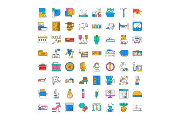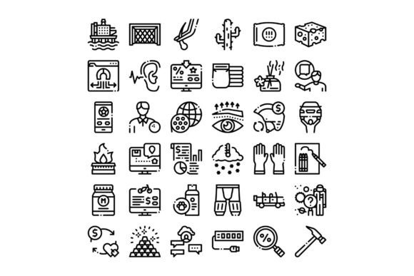
Diverse Outline Icons Collection
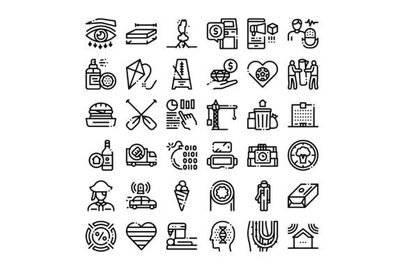
Icons are the quiet diplomats of digital design—small, unobtrusive, yet essential for guiding users, clarifying meaning, and reinforcing brand voice. The Diverse Outline Icons Collection stands out not because it’s flashy or overly detailed, but because it’s thoughtfully built for real work: clean line icons spanning business, technology, finance, education, logistics, health, and everyday digital life—all designed with consistency, scalability, and clarity in mind.
What Makes This Collection Different
Unlike icon sets that chase trends with heavy shadows, exaggerated gradients, or inconsistent stroke weights, the Diverse Outline Icons Collection prioritizes legibility at small sizes, adaptability across interfaces, and visual harmony. Every icon uses a uniform 2-pixel stroke, subtle corner rounding, and balanced negative space—so whether you’re placing one beside a menu item at 16px or scaling it to 96px for an infographic header, it holds its shape and intent.
It’s not just about aesthetics. Each icon is conceptually grounded: a “blockchain” icon doesn’t rely on abstract crypto symbols—it shows interlinked nodes with clear directional flow; “data privacy” combines a shield and a keyhole without visual clutter; “remote team” uses distinct, inclusive silhouettes—not generic stick figures. That attention to semantic accuracy saves time during content creation and reduces ambiguity for global audiences.
Where These Icons Actually Shine
Professionals don’t reach for icons to fill space—they use them to solve problems. Here’s where the Diverse Outline Icons Collection delivers measurable value:
- Product dashboards: Engineers and product managers embed these icons into status indicators (e.g., “API latency,” “uptime,” “user onboarding stage”) to replace text-heavy tooltips—cutting cognitive load while keeping UIs lean.
- Educational slides and course modules: Educators layer icons over key concepts—like “critical thinking,” “peer review,” or “feedback loop”—to anchor ideas visually without distracting from core content.
- Marketing landing pages: SaaS startups use the finance and analytics icons (“CAC,” “LTV,” “conversion funnel”) alongside metrics to build credibility fast—no need for lengthy explanations when the icon + number tells the story.
- Internal documentation: Tech teams add icons next to section headers in Notion or Confluence—“Security policy,” “Deployment checklist,” “Incident response”—making dense docs scannable in seconds.
- Print-ready infographics: Designers export SVGs directly into Illustrator or InDesign—no pixelation, no manual cleanup—and pair them with minimal color accents to keep focus on data narratives.
Real-World Usage Tips You Won’t Find in the Readme
If you’ve ever dropped an icon into a project only to realize later it clashes with your type scale or throws off vertical rhythm, you’ll appreciate how this collection handles spacing. All icons align cleanly to a 24×24 grid with consistent baseline positioning—so they sit evenly next to body text at 14–16px, and scale predictably with CSS font-size or transform.
One practical note: avoid overloading icon-only navigation bars. Even with strong visual design, accessibility guidelines still require visible labels or ARIA support. Use the Diverse Outline Icons Collection to enhance—not replace—clarity. For example, pair the “settings” icon with the word “Settings” on desktop, then switch to icon-only on mobile *only* if your analytics show high repeat-user engagement and low support tickets around navigation confusion.
Also worth noting: while the set includes 300+ icons, it intentionally omits overly niche or culturally loaded symbols (e.g., no “metaverse” or “NFT wallet” icons). That’s deliberate—not every trend deserves permanent real estate in your design system. Instead, it focuses on enduring concepts: “collaboration,” “backup,” “compliance,” “user journey,” “forecasting.” That longevity means less redesign debt down the road.
Integration That Fits Your Workflow—Not the Other Way Around
Whether you’re using Figma, Sketch, Adobe XD, or plain HTML/CSS, the Diverse Outline Icons Collection works without friction. SVG files are optimized (no hidden layers, redundant paths, or embedded raster images), so they load fast and compress well. In code, they slot neatly into inline SVG workflows or as background images via CSS—no extra JavaScript libraries required.
For developers building React or Vue components, many teams extract the most-used icons into reusable components with props for size, color, and aria-labels—keeping consistency across apps while allowing dynamic theming. One fintech client reduced icon-related PR review cycles by 40% after standardizing on this set, simply because designers and engineers shared the same source of truth.
Choosing Wisely—Beyond the Preview Grid
Before committing to any icon set, test three things in your actual environment:
- Legibility at your smallest intended size—drop a few candidates into your live UI at 18px and scroll past them. Do they read instantly, or do you pause to decode?
- Color flexibility—try them in your primary brand color, neutral grays, and high-contrast dark mode. Do strokes remain crisp? Does detail vanish in monochrome?
- Conceptual alignment—does the “cloud storage” icon suggest security and reliability—or just vaporware? Trust your gut here. If your audience hesitates, the icon isn’t working.
The Diverse Outline Icons Collection passes all three consistently. It doesn’t try to be everything—but what it does, it does with quiet precision.
A Subtle Upgrade With Compounding Returns
You won’t get viral tweets or case studies boasting about icon choice. But you *will* notice faster handoffs between design and dev, fewer “what does this mean?” Slack messages from stakeholders, smoother user testing sessions, and cleaner presentations that land ideas faster. That’s the cumulative effect of choosing a dependable, human-centered resource like the Diverse Outline Icons Collection.
It’s not about decoration. It’s about reducing friction—one clear, consistent, well-considered icon at a time.