Outline Icon Set for Various Concepts: A Practical Guide to Visual Clarity Across Domains
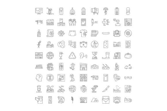
Icons are more than decorative elements—they’re visual shorthand. In an era where attention spans shrink and interfaces grow more complex, outline icons deliver precision, scalability, and universal recognition without visual clutter. An Outline Icon Set for Various Concepts stands apart not just by volume, but by intentionality: each glyph is crafted to represent abstract ideas with fidelity across business strategy, clinical workflows, digital product design, and educational materials. Unlike filled or gradient-heavy alternatives, outline icons prioritize legibility at small sizes, adapt gracefully to light/dark modes, and integrate seamlessly into responsive layouts—making them indispensable for designers, developers, educators, and content strategists alike.
Why Outline Icons Excel in Cross-Domain Communication
The structural simplicity of outline icons—defined by clean strokes, consistent stroke weight (typically 1.5–2px), and open negative space—creates inherent versatility. When representing a concept like “collaboration,” a pair of interlocking figures in outline form avoids cultural or gendered assumptions embedded in photorealistic assets. Similarly, an outline icon for “data encryption” uses a shield with a subtle keyhole rather than a literal lock, balancing abstraction with immediate cognitive resonance.
This clarity becomes critical when scaling across domains. A healthcare app might use the same outline icon for “appointment” in both patient-facing scheduling tools and clinician dashboards—ensuring consistency without sacrificing context. Likewise, an e-commerce platform can deploy the same shopping cart outline icon across mobile checkout flows, desktop analytics reports, and printed fulfillment guides, reinforcing brand coherence while reducing cognitive load.
Business and Strategy Visualization
In strategic documentation—think SWOT analyses, OKR dashboards, or process maps—outline icons replace verbose labels without ambiguity. An outline icon for “stakeholder alignment” (two overlapping circles with intersecting arrows) communicates interdependence more efficiently than text. Teams building investor decks or internal roadmaps use these glyphs to annotate timelines, map decision trees, or differentiate initiative types (e.g., “innovation,” “optimization,” “compliance”)—all while maintaining visual hierarchy and print-ready fidelity.
Technology and Interface Design
For web and mobile UIs, outline icons support progressive disclosure: a settings gear appears in navigation bars; tapping reveals a submenu where finer-grained outline icons (e.g., “notifications,” “privacy controls,” “accessibility”) guide users without overwhelming. Their SVG-native structure ensures crisp rendering on retina displays and smooth CSS transitions—hover states can subtly thicken strokes or add minimal color fills without breaking consistency. Developers benefit from lightweight, accessible markup: each icon includes proper aria-label attributes and scales responsively via viewBox attributes.
Healthcare and Clinical Contexts
Clinical infographics demand accuracy and neutrality. An outline icon set covering health concepts avoids misleading anthropomorphism—e.g., a heart icon focuses on anatomical proportion and rhythm (subtle pulse line), not stylized romance. In telehealth platforms, outline icons for “vital signs,” “medication adherence,” or “mental wellness check-in” appear in patient onboarding flows, helping non-clinical users navigate sensitive topics with dignity. Researchers compiling public health reports use these icons to visualize epidemiological trends across multilingual audiences—where text labels may require translation, icons retain semantic stability.
Education and Learning Materials
Educators leverage outline icons to scaffold understanding. A biology lesson on cellular respiration uses distinct outline icons for “mitochondria,” “ATP,” and “oxygen exchange”—each visually differentiated yet stylistically unified. In inclusive classrooms, these icons support neurodiverse learners by reducing textual dependency while preserving conceptual rigor. Curriculum designers embed them in interactive PDFs, LMS modules, and printable flashcards—knowing they’ll render identically whether viewed on a tablet, projector, or braille-compatible screen reader (when paired with descriptive alt text).
Travel, Commerce, and Lifestyle Contexts
Travel itineraries gain scannability through contextual outline icons: a minimalist airplane denotes flights, a suitcase marks baggage policies, and a leaf icon signals eco-certified accommodations. E-commerce sites use them to clarify trust signals—“secure checkout” (shield + checkmark), “free returns” (arrows in circle), “local pickup” (building + person)—reducing cart abandonment by preempting user questions. Lifestyle blogs embed them in habit-tracking templates: a water droplet for hydration, a dumbbell for movement, a moon for sleep hygiene—transforming abstract goals into tangible, visual milestones.
Design Integrity and Technical Considerations
A high-quality Outline Icon Set for Various Concepts adheres to strict design systems principles. Stroke consistency isn’t aesthetic preference—it’s functional necessity. Icons with varying stroke weights create visual noise; inconsistent corner radii (e.g., some icons using sharp angles, others soft curves) fracture cohesion. Leading sets enforce a unified grid (often 24×24 or 32×32 px), aligning baselines and optical centers so icons stack predictably in toolbars or comparison tables.
Accessibility is non-negotiable. Outline icons must pass contrast checks against background colors (minimum 4.5:1 for standard text size). Pure black-on-white outlines often fail in dark mode—so robust sets include pre-tested variants with adjusted stroke opacity or subtle fill overlays. Keyboard navigability matters too: icons used as interactive elements require focus states and role attributes (role="button" or role="link") to ensure operability for screen reader users.
File format flexibility extends utility. While SVG remains ideal for web use (scalable, styleable via CSS), downloadable packages include optimized PNGs for legacy CMS platforms and font files (.woff2) for developers embedding icons as typographic characters—reducing HTTP requests without sacrificing resolution.
User-Centric Implementation Patterns
How professionals actually deploy these icons reveals nuanced best practices:
- Content Strategists use outline icons to chunk long-form articles—placing a “key insight” icon before pivotal paragraphs, or a “research note” icon beside cited studies—guiding readers through layered information without disrupting flow.
- Product Managers embed them in user story maps: an outline icon for “user pain point” (frowning face with question mark) distinguishes friction areas from “delight moments” (smiling face + spark), making backlog prioritization visually intuitive during cross-functional workshops.
- Researchers apply them in qualitative coding—assigning unique outline icons to thematic codes (e.g., “trust barrier,” “feature gap,” “emotional trigger”) during transcript analysis, then exporting coded segments with visual tags into presentations for stakeholder reviews.
- Hobbyists and Educators combine them in maker projects: laser-cutting outline icons onto wood tokens for classroom gamification, or embroidering simplified versions onto fabric journals—proving their adaptability beyond digital screens.
Evolution Beyond Decoration: Toward Semantic Consistency
The most impactful use of an Outline Icon Set for Various Concepts isn’t ornamental—it’s systemic. Organizations adopting these icons as part of a living design system treat them like typography or color palettes: governed by usage guidelines, versioned alongside component libraries, and audited quarterly for conceptual relevance. When a new concept emerges—say, “AI ethics review” or “carbon footprint tracking”—teams don’t commission bespoke illustrations; they extend the existing set using established stroke logic and grid rules, preserving visual continuity while expanding semantic coverage.
This discipline pays dividends in localization. Translating interface copy across 12 languages multiplies QA complexity—but outline icons remain stable anchors. A “payment method” icon (credit card + waveform) conveys intent identically in Tokyo, São Paulo, or Helsinki, reducing translation costs and minimizing misinterpretation risk in regulated industries like fintech or telemedicine.
Selecting and Integrating the Right Collection
Not all outline icon libraries deliver equal value. Prioritize sets that:
- Offer conceptual breadth—not just objects (“laptop,” “map pin”) but abstractions (“scalability,” “resilience,” “equity”)—with clear, unambiguous visual metaphors;
- Provide technical documentation, including accessibility guidance, CSS class naming conventions, and Figma/Sketch plugin compatibility;
- Support customization workflows, allowing stroke weight adjustment, color overrides, and icon pairing suggestions (e.g., “use ‘cloud upload’ with ‘sync’ for backup workflows”);
- Include usage examples mapped to real scenarios—like how to combine “user journey,” “pain point,” and “solution prototype” icons in service design sprints.
Implementation needn’t be monolithic. Start small: replace three high-friction text labels in a dashboard with outline icons, measure task completion time, then iterate. Embed one icon per infographic to test comprehension speed with diverse audiences. The goal isn’t icon saturation—it’s strategic visual economy.
Looking Ahead: Where Outline Icons Are Heading
Emerging needs are reshaping outline icon design. Motion is entering the lexicon—not as flashy animations, but as subtle, purposeful micro-interactions: a loading spinner icon that pulses with rhythmic stroke expansion, or a “saved” checkmark that draws itself sequentially. Variable fonts now extend to iconography, enabling stroke weight to adjust dynamically based on container width or user preference settings. And as AI-assisted design tools mature, outline icon sets are becoming training data for generative interfaces—allowing designers to prompt “create an outline icon for ‘digital detox’ using this set’s stroke language” with reliable, on-brand outputs.
Ultimately, the enduring power of an Outline Icon Set for Various Concepts lies in its quiet authority: it doesn’t shout. It clarifies. It connects. Whether mapping global supply chains or explaining mindfulness techniques to teenagers, it delivers meaning with economy, precision, and respect—for the user’s time, cognition, and context.